
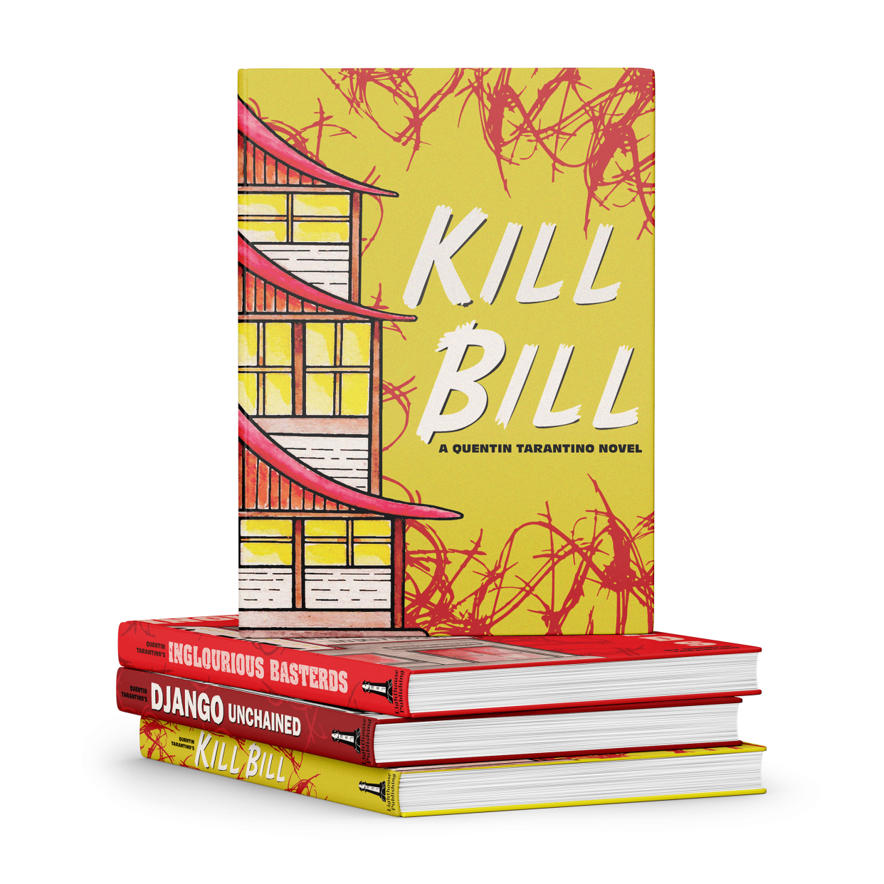
This illustration series takes inspiration from the wildly gory stylings of Quentin Tarantino
to make a beautifully cohesive book cover series.
to make a beautifully cohesive book cover series.
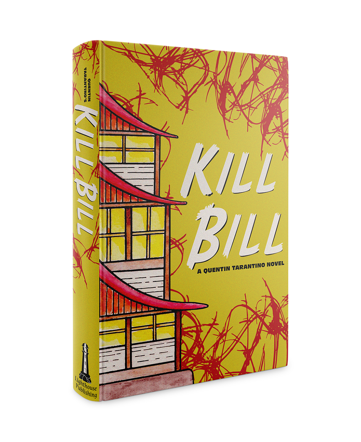
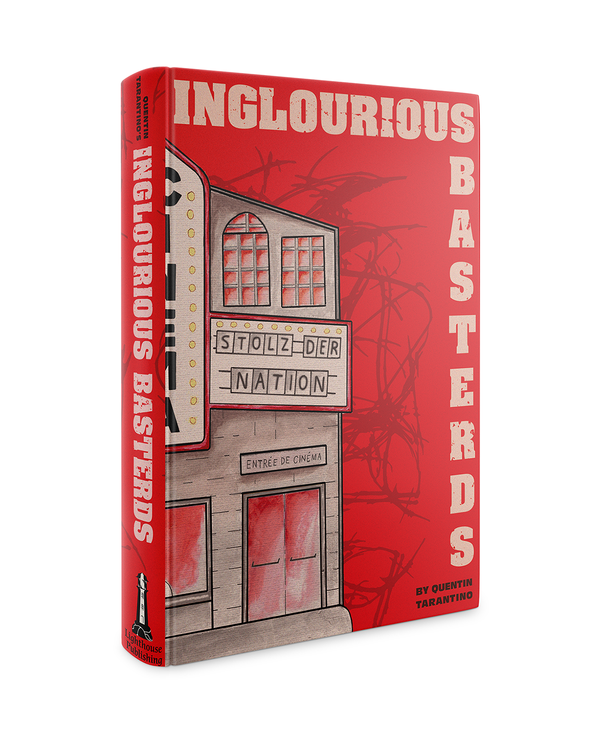
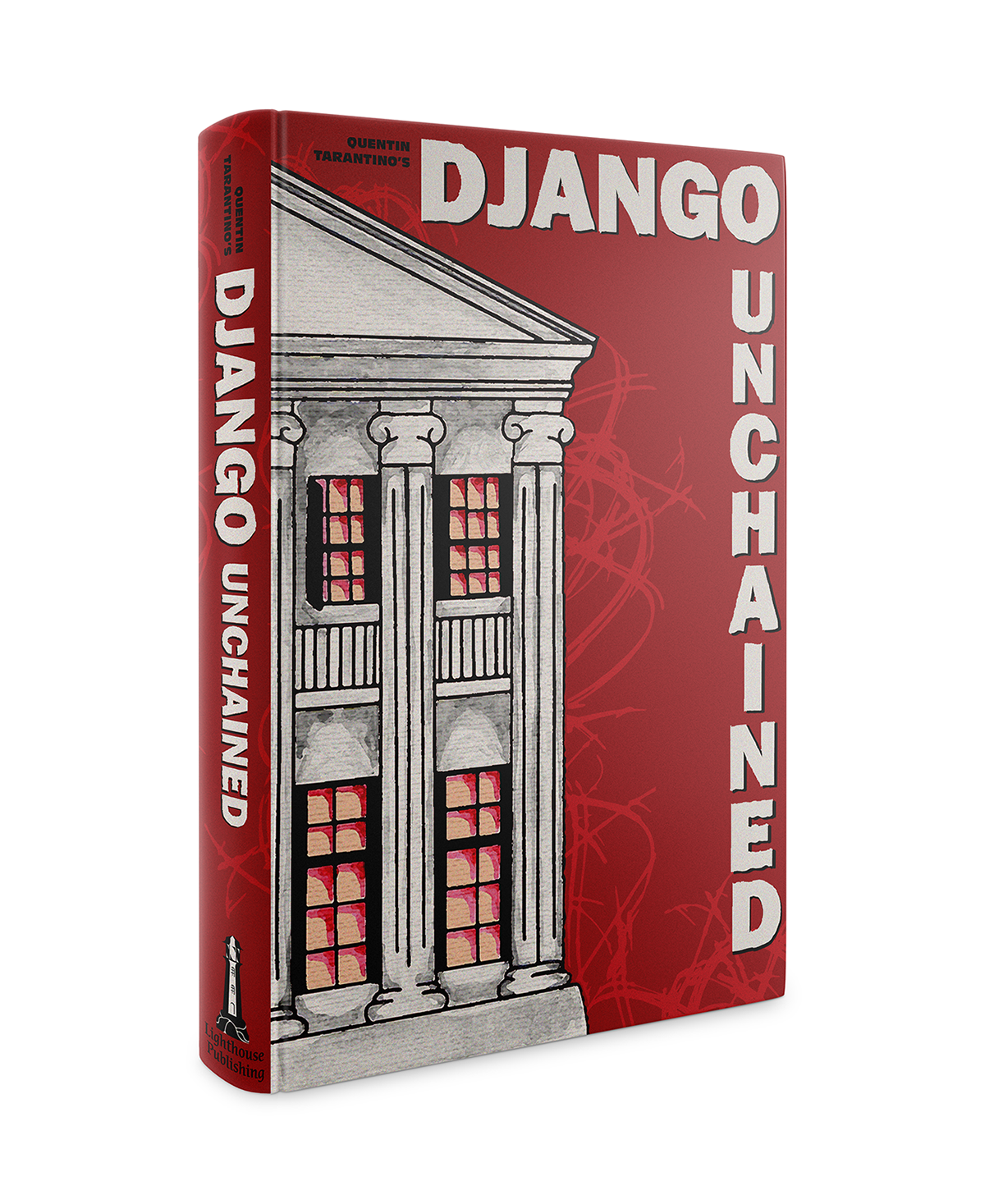
Each cover in this series contain key scenes from the movie it's based on. Each building was completed with hand done water colour and scanned in digitally to heighten their colours and styles. All of the covers are accompanied by a blood red abstract effect
to help identify them as the Quentin Tarantino brand of stories. Using three
distinct but cohesive colours the series pulls of a great
blocking effect especially for viewing on a shelf.
to help identify them as the Quentin Tarantino brand of stories. Using three
distinct but cohesive colours the series pulls of a great
blocking effect especially for viewing on a shelf.

The logo created for the fictional ‘Lighthouse Publishing’ was based off of the Peggy’s Cove lighthouse in Nova Scotia. The logo consists of a tall, eye catching lighthouse built on top of a rock structure
with type chosen to match old typewriter/print fonts.
with type chosen to match old typewriter/print fonts.